NATALIA DYACHENKO

Visa agent
Website
Branding
Natalia Dyachenko is a visa agent, travel and immigration expert for Australia. She has a large team, a large schedule of meetings and webinars, as well as very difficult to understand services.
That's why we needed a website that was as easy to understand as possible, and to broadcast lightness and friendliness in the design.
That's why we needed a website that was as easy to understand as possible, and to broadcast lightness and friendliness in the design.
About the project
The purpose of the website: to inform customers about their options in planning a move or tourism to a new country. And lead to an application for a personal consultation with an expert.
Work stages
Briefing
Together with the marketing specialist, we drew up the technical specifications for the logo and determined the development timeline
Strategy
We made a strategy around deadlines, made the process transparent and predictable
Development
We decided to develop the logo and website at the same time. We outlined a general direction on colors and made several variants of website design and logo sketches
Project handoff
Approved one final logo design and launched the site. Then we continued working on additional sections of the site
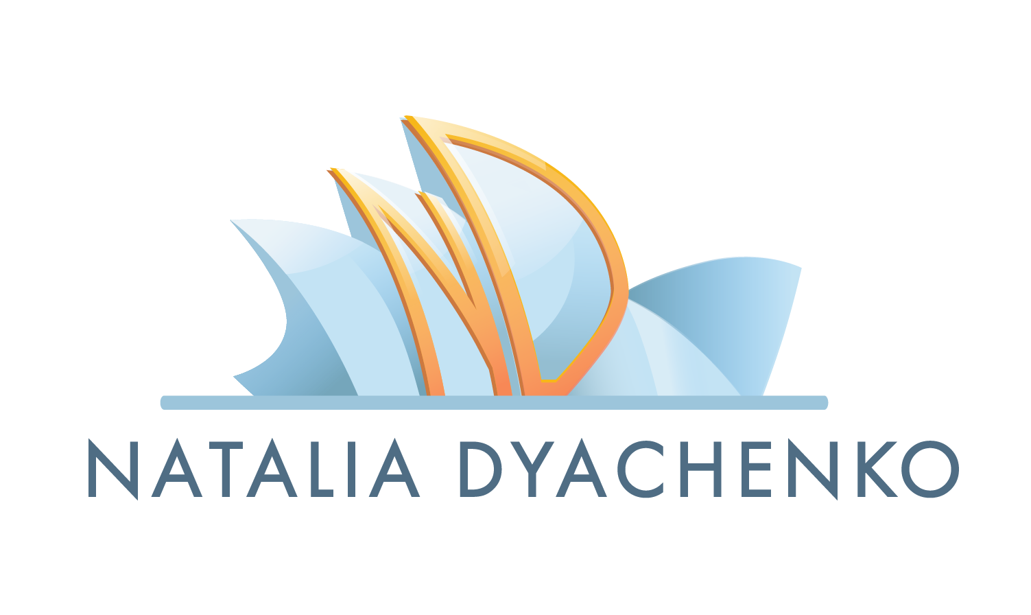
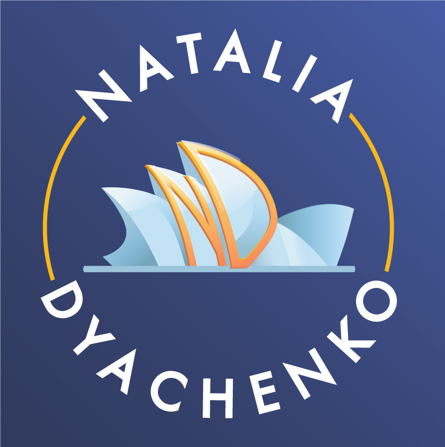
The logo consists of a thematic composition and a font part.
Since the agent's location is Australia, the logo features the silhouette of the famous Sydney Opera House.
In the center of the composition are the initials of the visa agent, taking a smooth outline of the theater's shapes.
Since the agent's location is Australia, the logo features the silhouette of the famous Sydney Opera House.
In the center of the composition are the initials of the visa agent, taking a smooth outline of the theater's shapes.
How we worked?
- Researched the audience
- Conducted a briefing
- Gathered terms of reference
- Suggested references
- Developed the designs
Branding
Brand colours
On a white background
Social media icons
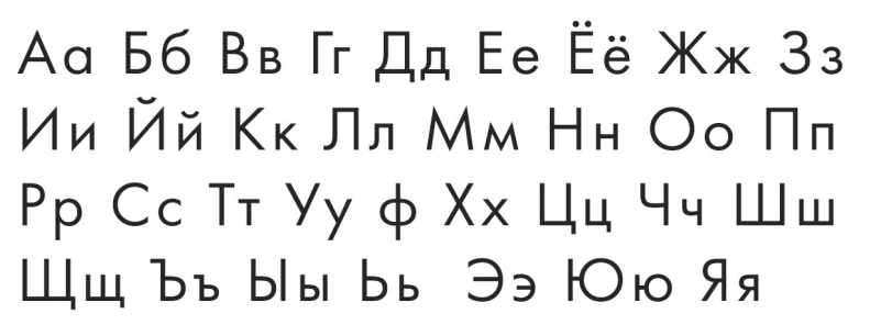
Main font

#75A6BB
On a blue background
Logo variations
#FBAB43
#35336D
#E7F1F8
How we worked?
- We held a briefing
- Gathered the terms of reference
- Prepared structure and references
- Developed design options
- Built the site on the Tilda
- Connected the domain
Website
Website structure
Fonts and colours
Timeline
Suggested design options
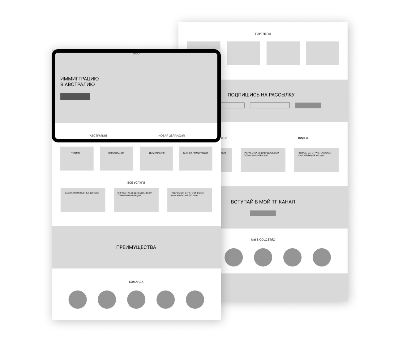
We gathered the structure of the future site. At this step, the strategy of work became clear at once - how much photo, video and text materials would be needed.
#ECD9CB
#78A39C

1
month
Together with the client we provided all the necessary buttons, location of forms for communication, blocks with benefits and description of the project.
#C2DEDA

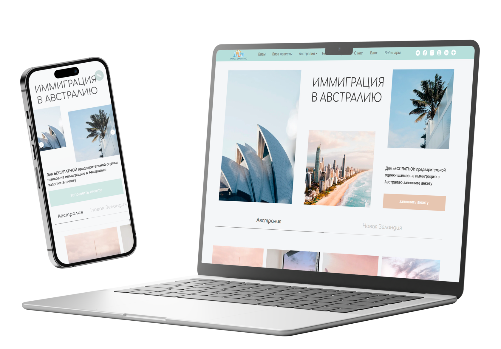
The site is built on the basis of the company's corporate identity, and this project is no exception.
The site was built exclusively in the fonts and colors of the brandbook
The site was built exclusively in the fonts and colors of the brandbook
It took 1 month to launch the project with a full package of services.
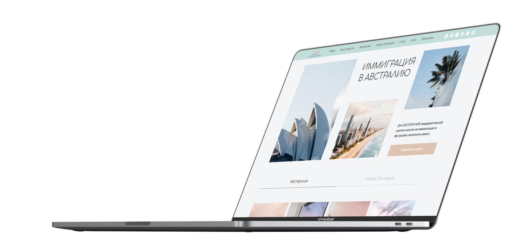
At this stage, the client is offered several design options, according to the references sent at the stage of structuring the pages of the site.
One option of the site is offered exclusively in the corporate style of the project, the rest are offered by the designer.
One option of the site is offered exclusively in the corporate style of the project, the rest are offered by the designer.
Client feedback
Project Manager's comment
I am very satisfied with the result of working with ITFlamingo. They created not only unique branding for me, but also a professional website.
I was pleasantly surprised how quickly and qualitatively they did their work. The branding turned out to be very memorable and attractive, and the website was user-friendly and informative.
I was pleasantly surprised how quickly and qualitatively they did their work. The branding turned out to be very memorable and attractive, and the website was user-friendly and informative.
My team showed great professionalism and responsibility at all stages of the project. They listened carefully to my requirements and offered their ideas!

Сontact us in any convenient way or leave a request and we will contact you
